Turner Architects
Service
Strategy & website
Scope
Website design
Digital
Project overview
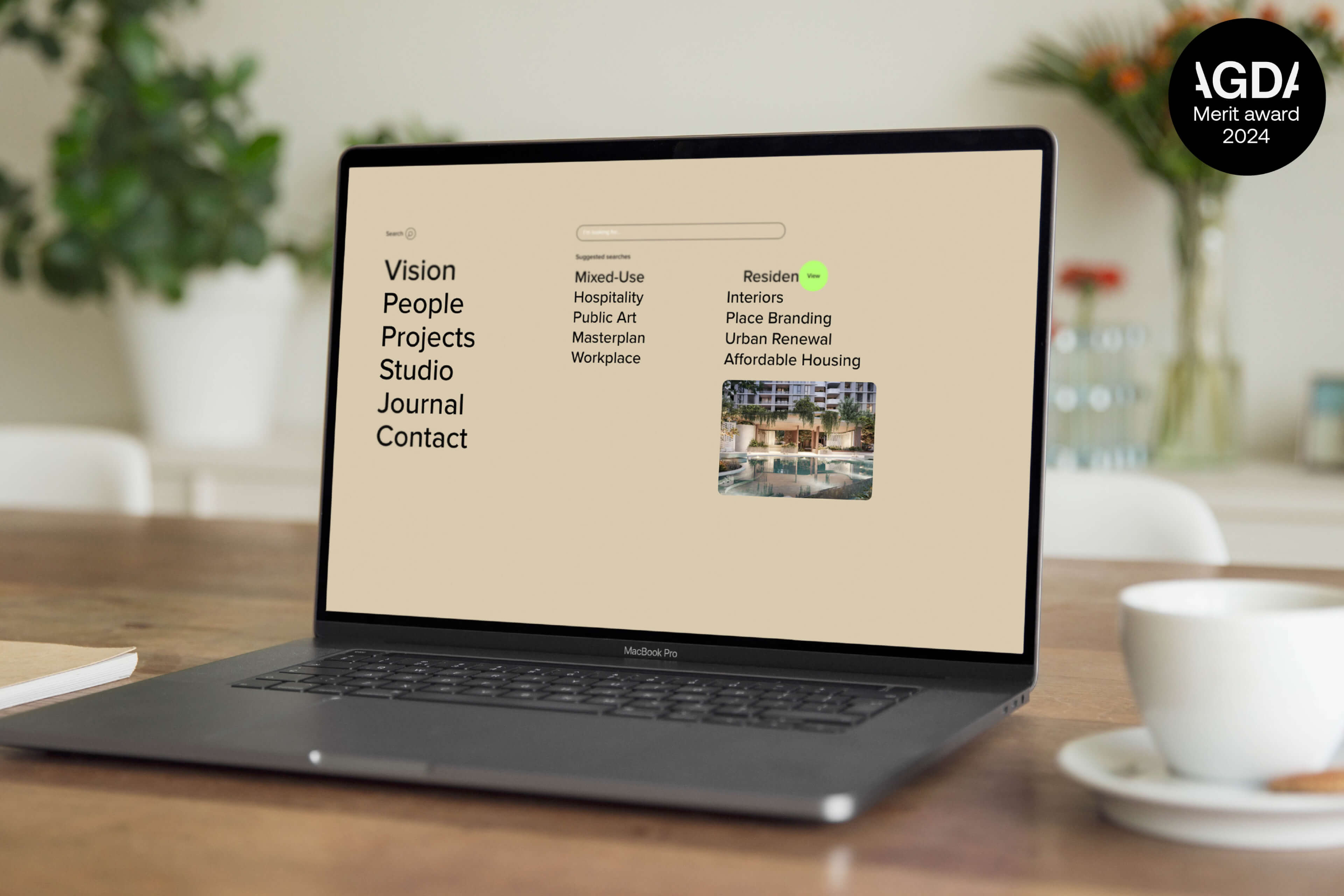
We kicked things off with a series of open and honest conversations with the Turner Studio leadership team, no pretense, just a clear look at where things stood. What became obvious early on was that their brand already had real strength. The values were there, the design philosophy was sharp, and their work spoke volumes. But the website? It wasn’t quite keeping up. It wasn’t reflecting the full story, especially when it came to the incredible work they were doing across a wide range of sectors.

The one Turner
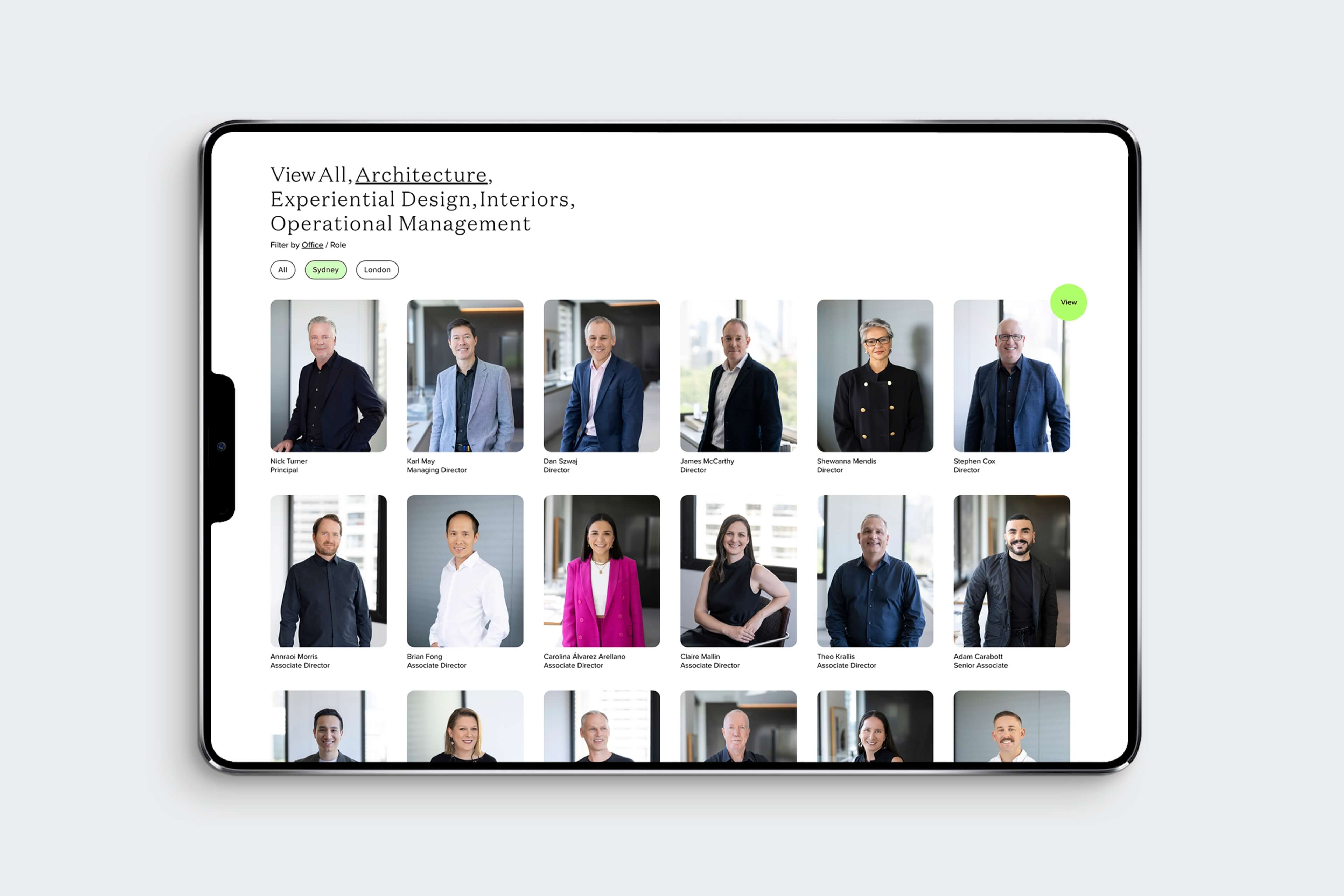
So, together, we set out to build a site that felt true to Turner, one that didn’t just showcase their architectural smarts, but helped unify their two studios in Sydney and London, and opened the door to growth in areas where they hadn’t always been front of mind.
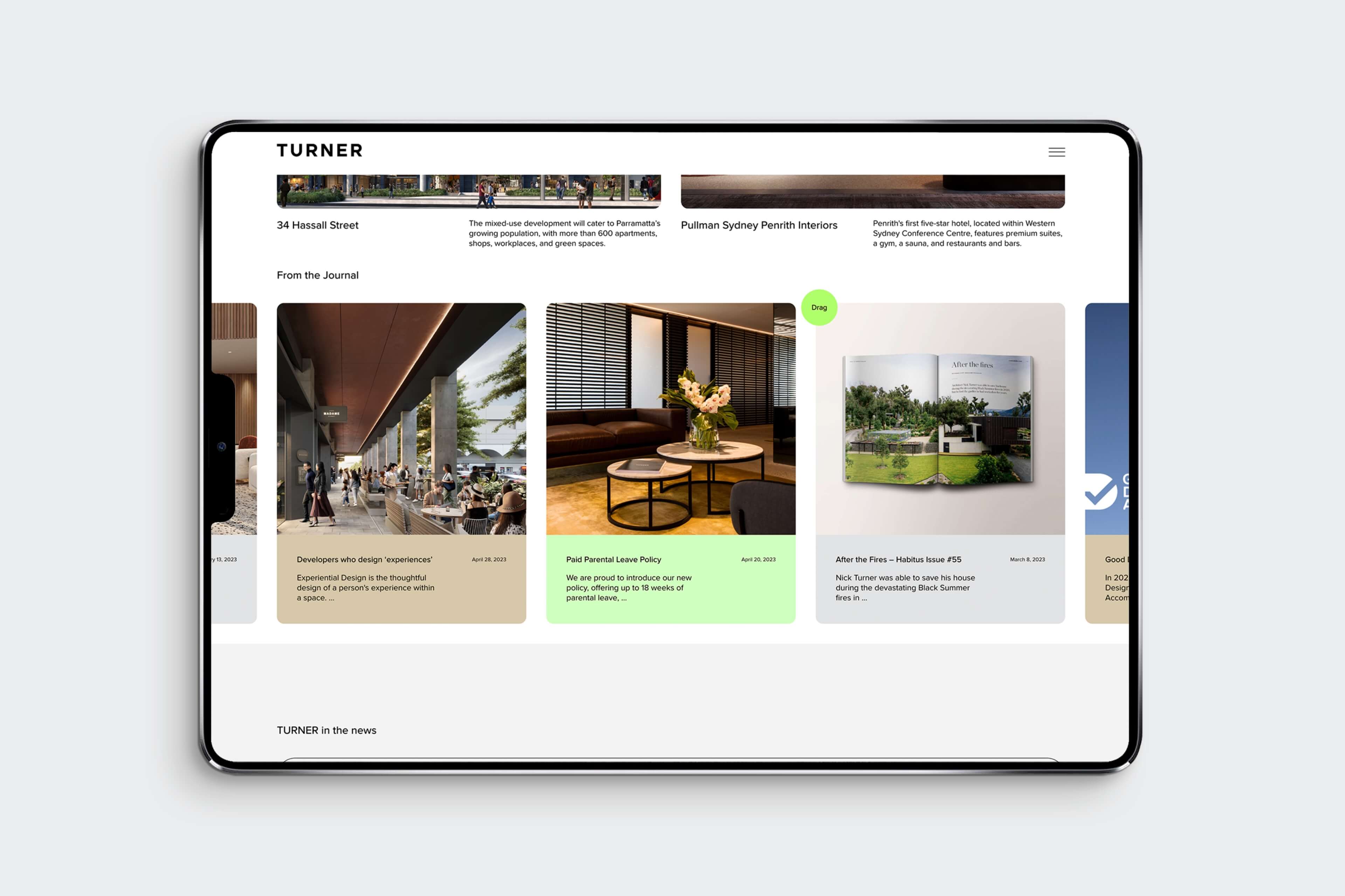
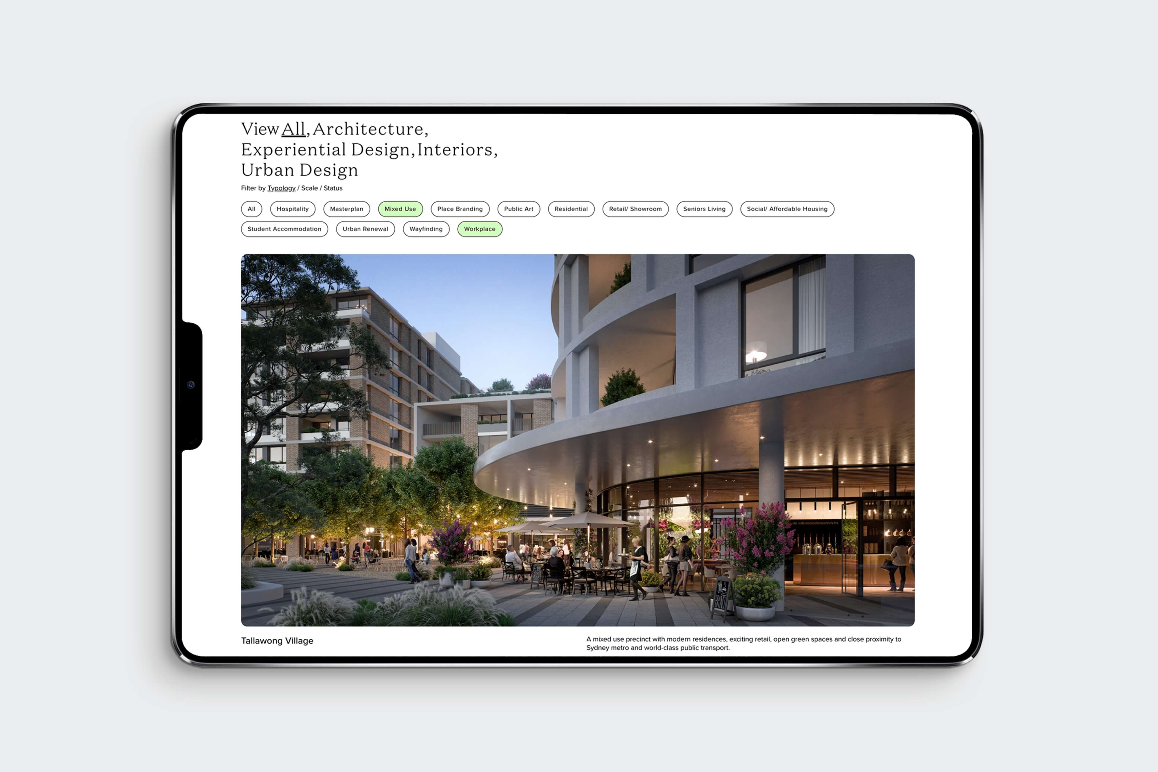
Our approach was all about clarity, creativity and a bit of well-placed magic. We kept the experience simple and intuitive, but added in a few thoughtful ‘interrupts’, small, strategic moments that draw attention to projects in sectors that people might not expect from Turner. These subtle nudges help broaden the perception of the studio without ever shouting. It’s all designed to feel effortless.
Reflecting who they are
We also wanted the website to feel like a natural extension of the team: confident but humble, considered but warm, and always focused on the work. From the visual language to the user journey, everything was crafted to reflect Turner’s personality and position in the market.
In the end, what we created together is more than just a new website, it’s a platform that brings their story to life, connects two continents, and gently pushes the boundaries of how people see the studio.

Testimonial
“Working with the team at Extrablack was a real pleasure. Before diving into the design, they worked with us to unpack our brand personality, key messages, and ambitions.
We explored what worked (and what didn’t) on our old site, looked at what others were doing, and identified what mattered most to us: less text, more imagery, seamless video integration, and intuitive design. They were patient, responsive and collaborative throughout every iteration.
The final site is visually rich and smartly interconnected; linking people, projects and ideas in a way that truly reflects how we work.”
– Karl May, Managing Director
Similar
projects
Contact
To get in touch...


